


Church End Brewery Christmas Campaign
RBH Creative Communications
The live brief I have chosen to work with for this module is the RBH Creative Communications design brief. Their client is the Church End Brewery. They are a hands-on craft brewery located in Warwickshire. They are currently working on a new beer, made especially for Christmas. For this new product they need a name and a design campaign to get the project running. It will be a limited edition beer sold across many pubs in the West Midlands. I need to keep in mind the audience I will need to aim the project towards. The brief states they aim their products towards male pub drinkers and connoisseurs of craft beer.
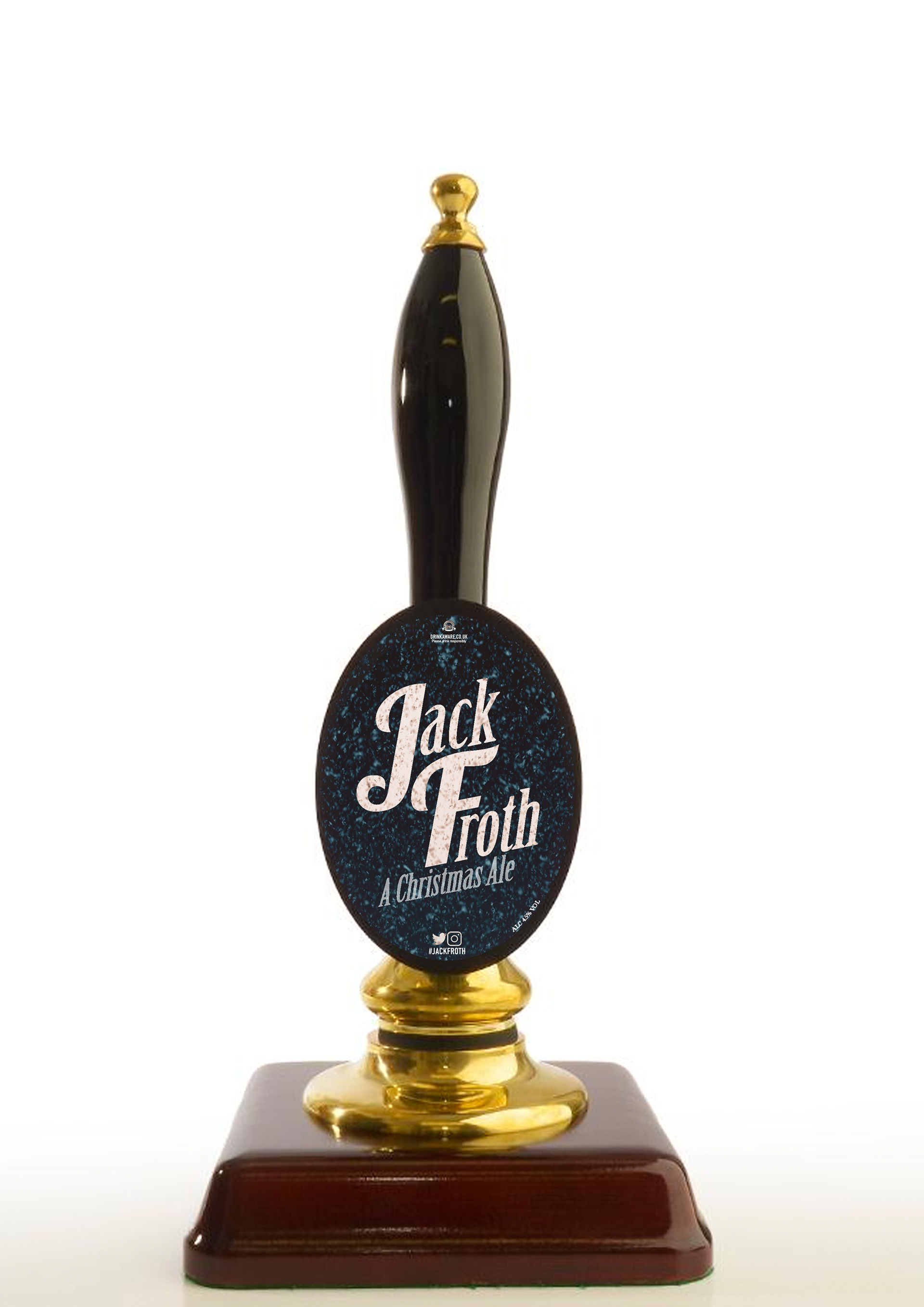
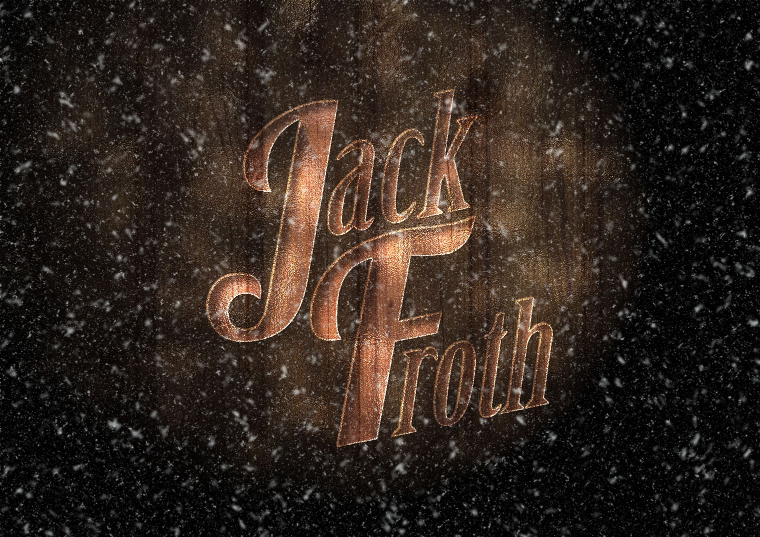
When I started this project, I immediately started name generating for the new beer, I knew this needed to be Christmas themed so I thought of many "corny" names such as “Lager Christmas”, “Pints in Caskets”, “Brussels Stouts” etc. I wanted to use a name that rolled off the tongue but I didn’t want to exaggerate this Christmas innuendos too much. So I finally settled for the name “Jack Froth”. This was a name I could immediately picture on a logo used as the name for a beer within a pub environment and would be appreciated by its audience.
For my live project, I wanted to create a logo that could be recognised as a representation for craft beer. So I did my research, looking into existing logo designs for beers around the world and I noticed some used illustrations and mixes of bold serif fonts, rarely any sans serif. So going by this information, I went through several different typefaces, I thought had the appearance for a craft beer. I then settled with a design that mixed two different typefaces together to create its own unique look (Birch Std and Lobster 1.3). I used Adobe Illustrator during this design process.
I realised I did not want to exaggerate the Christmas theme too much within my designs as I thought this would not be very fitting for the campaigns target audience and might come across slightly childish when promoting a new beer. I did experiment implementing illustration like a christmas hat and a snowman onto the logo but I felt I was overcomplicating it and the logo worked best on its own as a typeface.
When I started to think about my promotional poster designs, I already knew they needed to be within a certain aesthetic when promoting an alcoholic beverage. I couldn’t make the message in the campaign seem like it was promoting drinking alcohol and thats all you should do during christmas. So I researched different competitors and how they advertise. I looked at many different ones but the company that stood out to me the most was Guinness.
Their promotional poster were all very unique and had a surreal element to them. Using different objects and scene to create the recognisable shape of a pint of beer along with a small subliminal slogan alongside the imagery. This was a style I knew I wanted to replicate in my own promotional poster designs. So I started to create scamps within my sketchbook of different idea and possible imagery I would use in my posters. All three of my final promotional poster design proposals had a photographic approach using pictures I had taken myself. It was important I used my own work in my creative journey so that I do not plagiarise others.
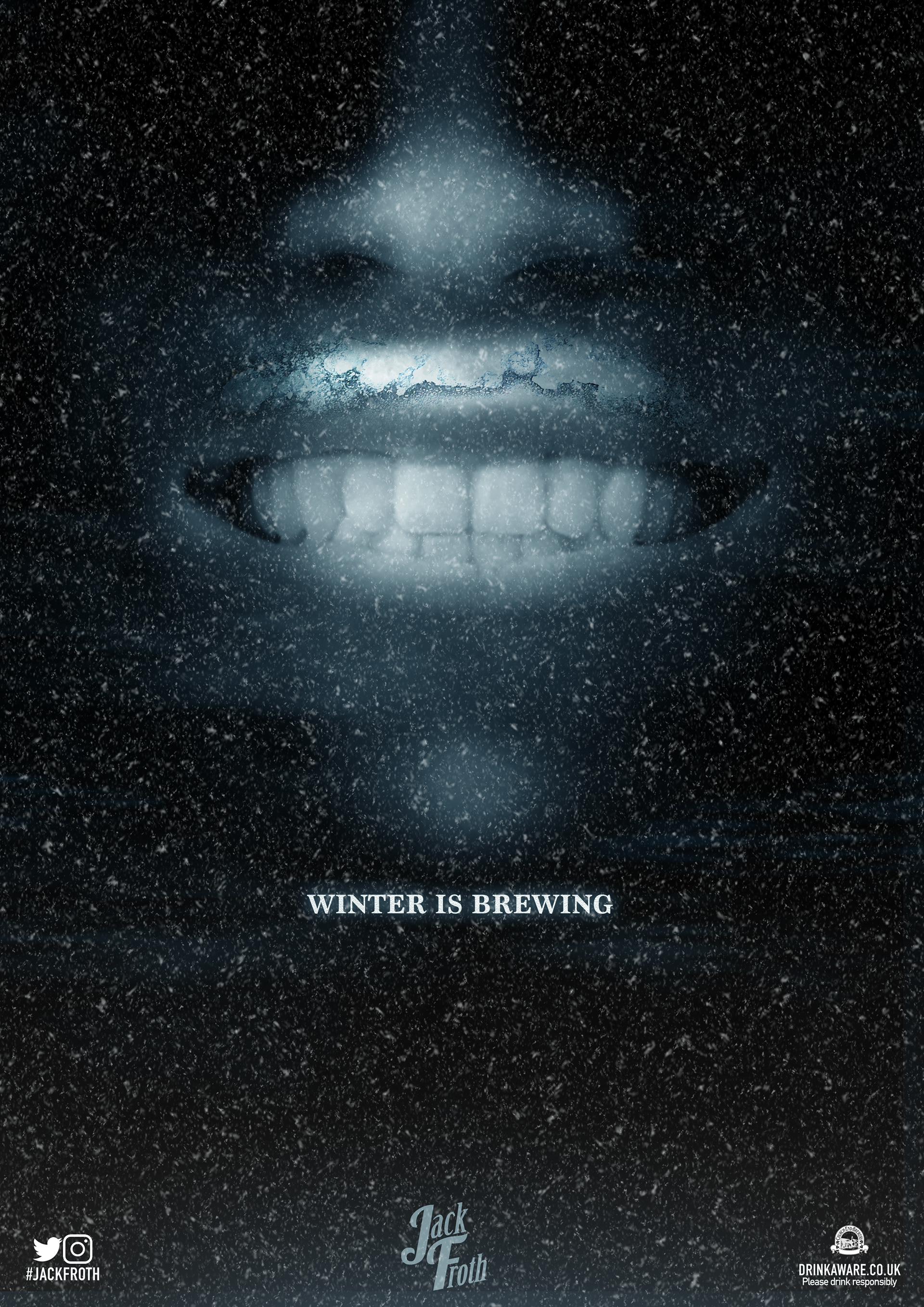
My first poster takes the birds eye view of a pint of beer and uses it within a snowy night sky to represent the moon. I then used bevel and emboss effects to make the logo look as though it is indented within the froth of the beer. I also settled with a small slogan for the brand underneath the imagery, which I would used throughout my other designs. This read “Winter is Brewing”. I thought this was an appropriate slogan for the brand as it is a play on words inspired from the advertising for the popular television show Game of Thrones. This is already a link to current pop culture, so the advertising has the capability to reach a further audience. I made such the slogan was a small font size because I wanted this poster to draw people in to have a closer look, then they would realise what the imagery is and be “hooked” on what is being advertised in the poster. This first poster design set the format for my other two posters.
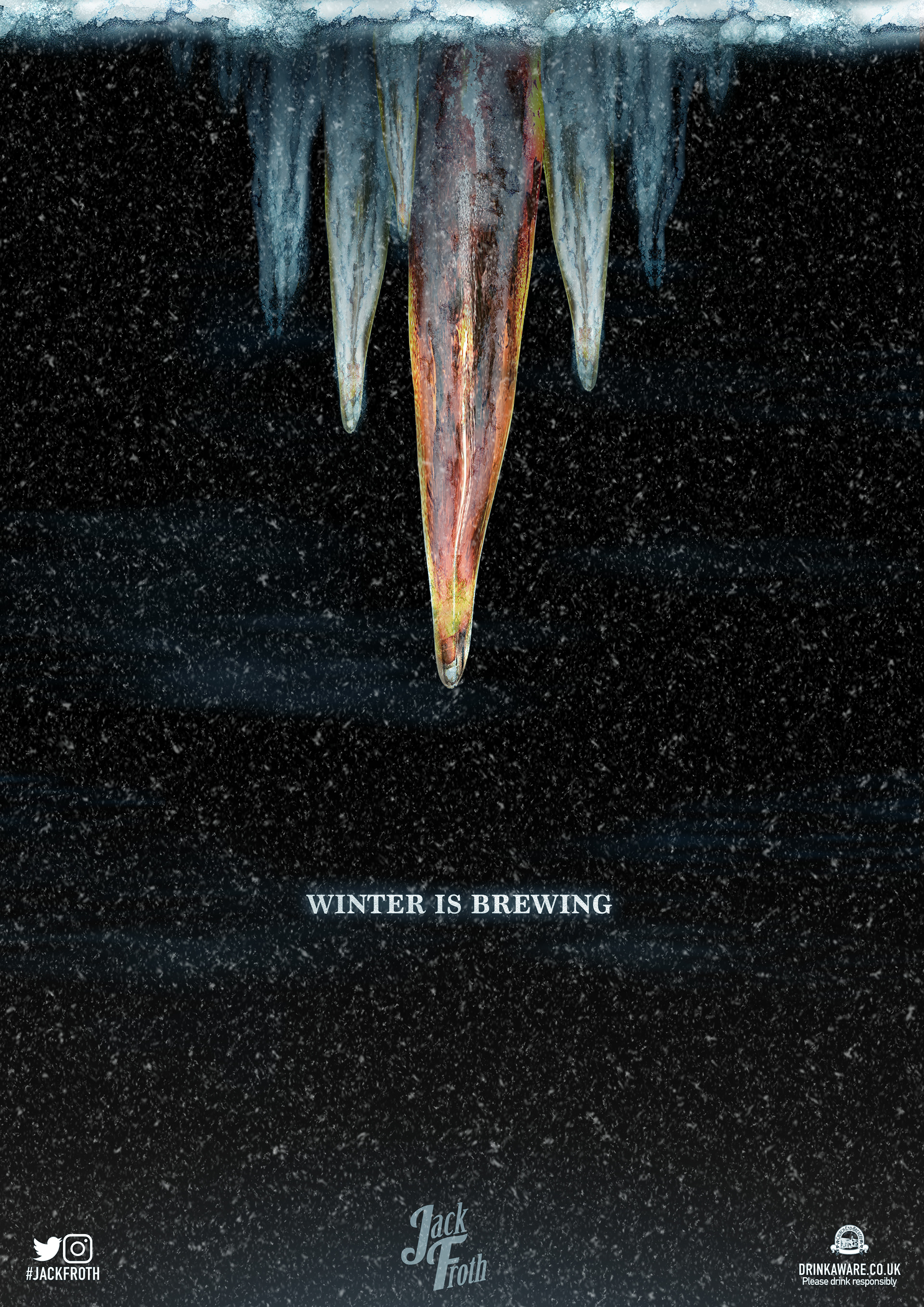
My next poster design involved using surreal imagery much like the Guinness advertisements did. I used Adobe Photoshop to make a mouth seem like it had just had a sip of beer with froth above their top lip. Instead of it actually being froth, I used an image of frost instead. This appearance played on the name Jack Froth within a single image, as the face itself could be interpreted as the character themselves. I tried to make these scene appear as mysterious as possible, I wanted people the audience to ask questions and feel the need to find out more about the product. Then my last poster design, which was icicles in a lined up group together, had a large icicle in the centre made to look like it was filled with beer. This image interprets the new beer to be icy cold fresh like it has literally been poured from inside a frozen icicle.
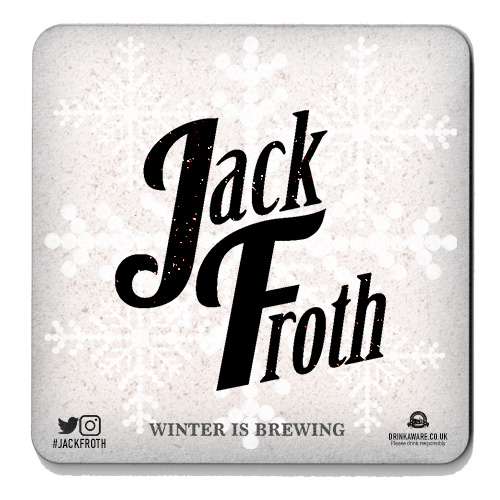
I feel all my poster designs worked very well and opened an opportunity for more surreal imagery to be interpreted from it, so there are many other design opportunities on the cards. They followed the right criteria and did not seem to purposefully encouraged drinking alcohol and only promoted the product itself, I also made sure I included the Church End Brewery logo in all my designs and the drinkaware.com website link. It was a different and not a predictable design route chosen for a Christmas themed beer. After getting my feedback from my clients after the presentations were over, they were very interested by my use of the birds eye view off the pint of beer and how that imagery could be worked with in so many different forms because I showed them how I used this image to also create snowflake patterns, which I used in my beer mat designs. So this is something I could experiment with further in my design development.
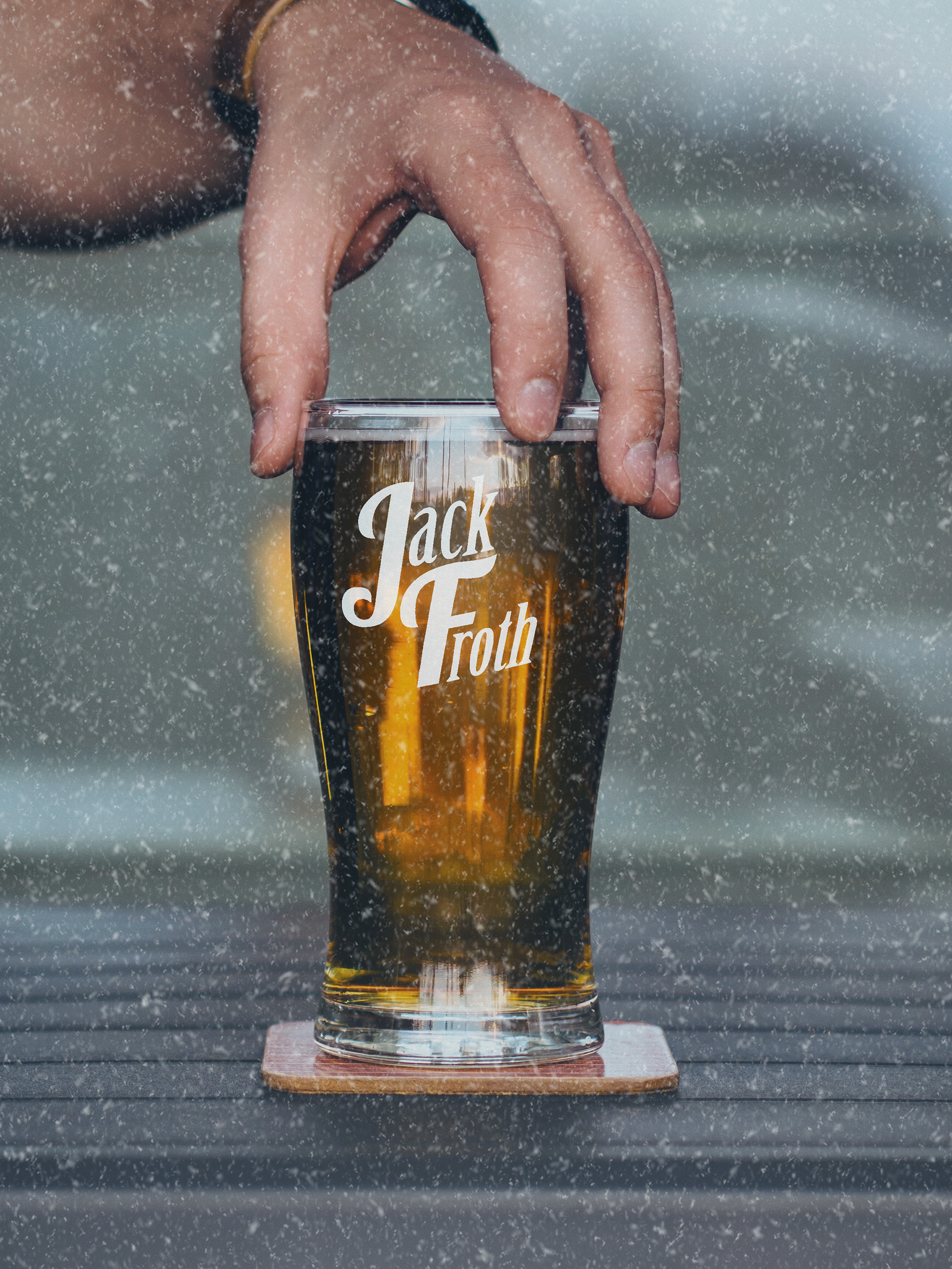
The presentation itself turned out to be a success, the clients really liked the name I had chosen, and written in my feedback stating it was a good play on words and the typography I used for the logo itself flowed beautifully and these thoughts carried over to my choice of the slogan being a clever hint to current pop culture. They enjoyed seeing the logo mocked up and working on pint glasses, pump clips and beer mats, all following the same recognisable aesthetic used in my other designs. I feel I could have put more time into the pump clip and beer mat designs but this was due to running out off time. They realised I did try to come up with a look for the Jack Froth character in my initial sketchbook development but they preferred to leave the idea of the Jack Froth character as a mystery. The mysterious theme was something I created in my poster designs so this was good to hear from the clients themselves. What made my work stand out to others was I created an advertising campaign that had swayed from the Christmas cliches like Father Christmas, Snowmen, presents etc, this made my work appear unique and different. However it still has its element of being based around the white weather winter theme you would expect to see in other advertisements during this season.
I would improve my presentation skills in the future by going over all my lines constantly and practising them more so I know exactly what I was going to be talking about when showcasing my work because I believe I probably missed some areas of information I should have included within the presentation. I feel as though this will help me appear to be talking about my designs with passion and confidence. Overall, I feel as though I had an excellent outcome that had a high quality feel and a professional performance. I managed to produced all the needed elements the client stated they needed in the brief within a particular time frame. For projects like these in the future I feel I need to improve my time management and try to not just settle with one idea at the very beginning of the design process and experiment by sketching more scamps with other design ideas that could have worked for the brief.
To be concluded, this was an exciting and fun project and feel it has expanded my knowledge for branding on product design that will help me for similar projects in the future.